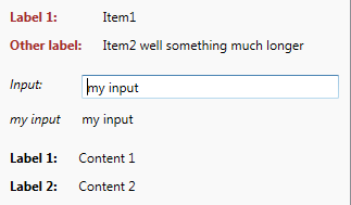
PropertySheet in JungleControls
PropertySheet control from JungleControls library represents a list of name-value pairs arranged vertically with headers on the left and values (usually read-only) on the right. It's designed to replace Grid for simple property sheets.

Sample XAML code:
<jc:PropertySheet xmlns:jc="clr-namespace:JungleControls;assembly=JungleControls">
    <TextBlock jc:PropertySheet.Header="Label 1:" Text="Content 1" />
    <TextBlock jc:PropertySheet.Header="Label 2:" Text="Content 2" />
</jc:PropertySheet>
Properties:
- Items - This is an implicit property where all the items inside of the PropertySheet are placed.
- Header - Attached property that is added to PropertySheet items to give them some header. It's usually text, but you can use any object in combination with HeaderTemplate.
- HeaderTemplate - Allows unlimited styling of the Header.
- Header* - Various visual properties of the header.
- Cell* - Various visual properties of the content area.